With everyone from Google to PayPal to LinkedIn ruining their website’s design and user experience, we were beginning to believe that no one would get it right. Finally, however, someone really did. Amazon has implemented a new redesign for their games section which has dramatically improved user experience.
I have gotten used to completely bashing all these companies for ruining their user experiences, and it may have left some people wondering if anyone will ever get a redesign right. The big companies are really all performing horribly at the new overwhelmingly redesigns they are forcing on their users. However, the fact that Amazon actually did it well on their new redesign shows that it’s not because we don’t like new things, but it is really because the redesigns suck.
Amazon is the first company in a long time to get a redesign right
I have to say that I absolutely love this new redesign. It improves usability, looks so much better, is refreshing to have something new, and best of all, decreases user clicks to get to what you want and improves usability.
Here is an example of a popular PS4 game which has the new design implemented. Apparently Amazon even has its own exclusive versions of some games.
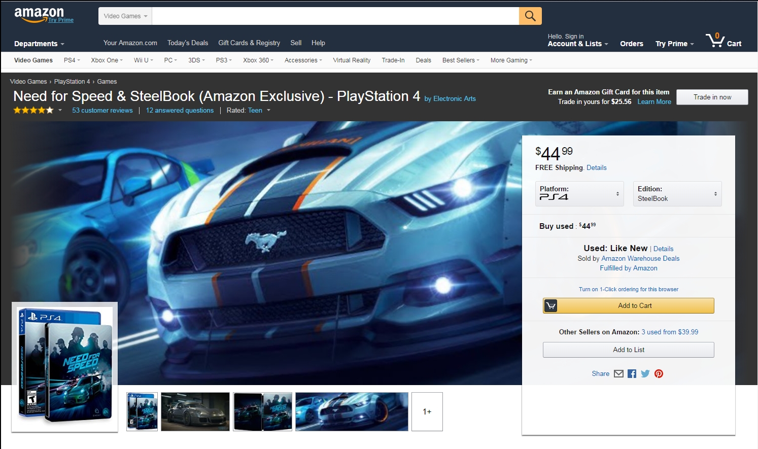
See the Amazon page for the Need for Speed Steelbook game page design
As you can see, there is now a big background image, really improving the look; the ratings and questions are at the top left directly under the title, and the images are moved to the bottom left. There is a bigger right box with excellent accessibility of console versions, editions, and other options like colors for accessories.
Additionally, it lefts you narrow down your choices all in one place. For example, as you can see below you can click on the console icon and choose between the various consoles or PC. Likewise, when you click on “Edition” button beside it, it shows all the edition options.
And for a close-up:
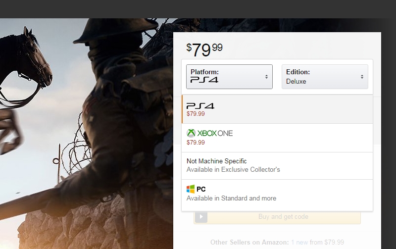
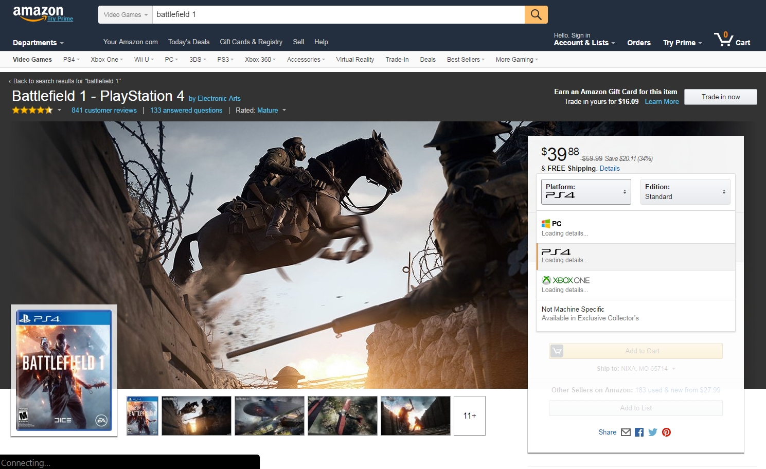
See the Amazon page for Battlefield 1 game page design
Previous user experience left much to be desired
Previously, say you wanted a PS4 game, you would search for PS4 game but then say you wanted a PC game, you would have to go to a different listing. Likewise, if you wanted one version of a game, sometimes you could get an upgrade option like on hard drives where you can choose between say 6TB or 10TB drives, but often you would have to search again to find it.
Previously, the games and consoles page used to be the same as other listings. For example, check out this datacenter 10TB drive which has other options for 1TB, 2TB, 6TB, 8TB, and 10TB drives:
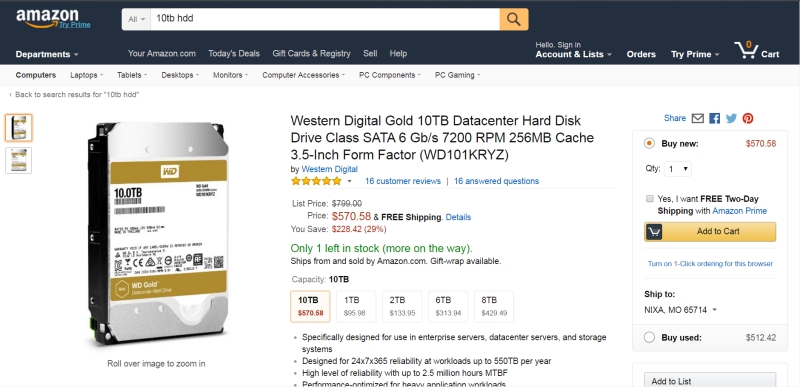
And for a close-up:
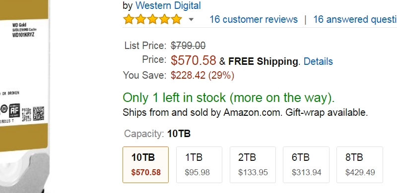
See the Amazon page for 10TB WD hard drive page design
This works well for things like hard drives, but not so much for things like video games. This old version of the sales page wasn’t a great user experience but one we could live with. However, it probably decreased sales because people don’t have the time to go searching around for different models or versions. Or, they might not even know to search for it.
Now, however, this is all in one place. I have to say I kind of think this looks a bit like the IMDB layout with the ratings and questions at the top, and a bit like modern consoles stores, while still an original, unique, refreshing new layout that is not only lovely but also a dramatically improved user experience.
The new Amazon redesign applies to more than just games
I have to say I am very impressed to see this new games redesign. Excited to see the new change, I checked around the site. Not only the video games, but also accessories and consoles are part of this new redesign.
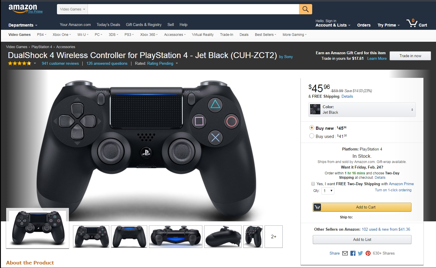
See the Amazon page for the PS4 controller and accessories page design
If you click on the Color option you can even choose your color this way. This is a huge improvement in user experience.
I was so excited upon seeing someone finally get a redesign right I just had to come over here and write an article about it. This excellent redesign by Amazon really puts Google, LinkedIn, and others to shame. Great job, Amazon, and I hope more companies can learn from your example.
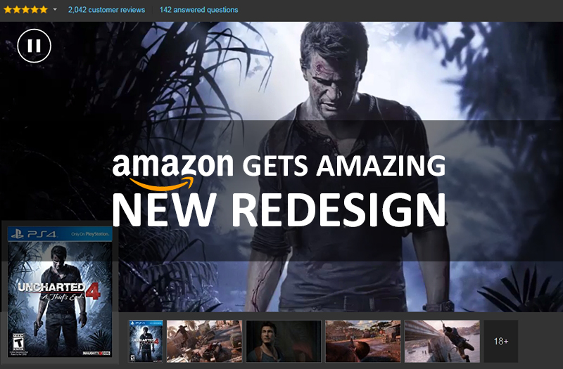
The new Amazon redesign even includes some video backgrounds
It is even complete with video backgrounds. Uncharted 4 has a video background which even further dramatically improves the UI design for games. It is unbelievable how awesome a job Amazon has done.
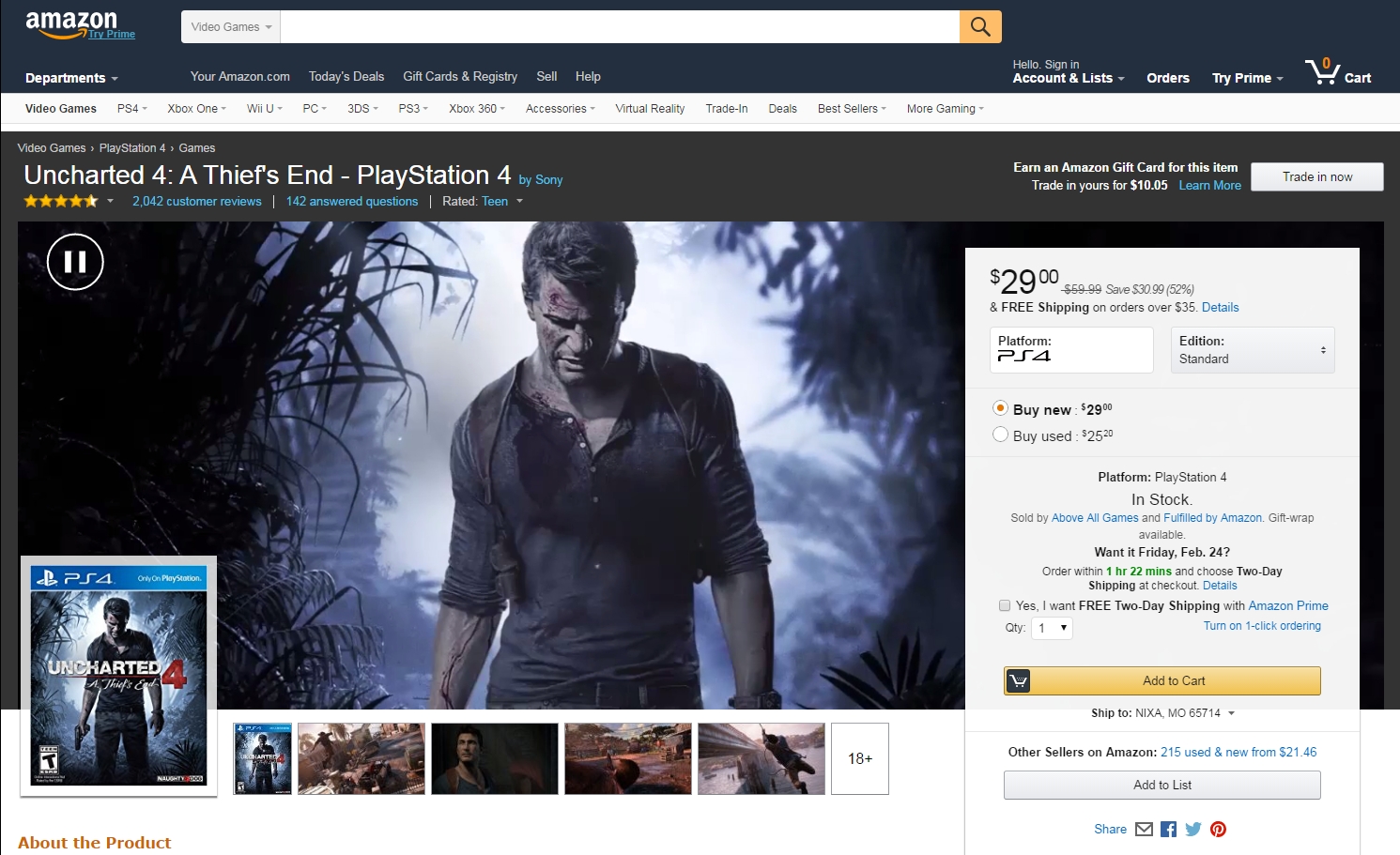
See the Amazon page for Uncharted 4 game page design with video background
Currently, I believe this new redesign only applies to the games section. Probably for the best. I like the old version for the hard drives and other shopping items. However, the new design looks amazing on the games section.
What do you think of the new Amazon redesign? Do you love it? Hate it? Think it’s really cool? Share your thoughts.

