Just when I was finally starting to really use LinkedIn, they have destroyed it. It is a popular trend nowadays for websites to completely obliterate their website and ruin it against the wishes of over 95% of their userbase.
LinkedIn has followed in this tradition, destroying their website. Just when I was starting to finally like LinkedIn, they have completely ruined it, and I will not be using LinkedIn anymore due to this terrible UI redesign.
It’s probable that a lot more people started using LinkedIn recently, because like me, people had finally gotten used to the layout and design. Then some morons over at LinkedIn decided, “hey, a lot more people are using it. Let’s make it better!” And then made it 100 times worse.
Is their redesign terrible from an aesthetic perspective? It is not terrible in that regard. Not great but not terrible. Not even really good, but not horrendous from an aesthetic standpoint. Where it is absolutely horrendous is its User Experience, or UX for short.
Yes, the new design looks a bit more modern. That is not why it sucks. Why is sucks is because they changed everything, and degraded almost everything, and generally ruined the whole site.
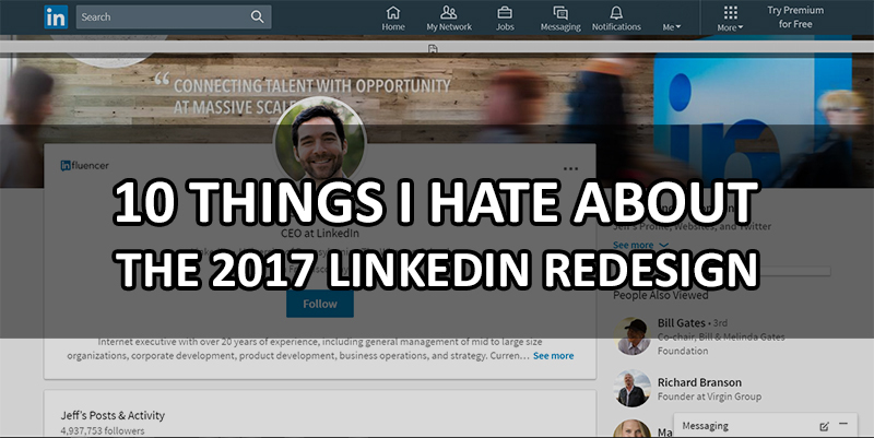
Here are the top 10 things I absolutely hate about the new LinkedIn redesign, and why the new redesign sucks more than a garden hose hooked up to a vacuum cleaner on a windy day.
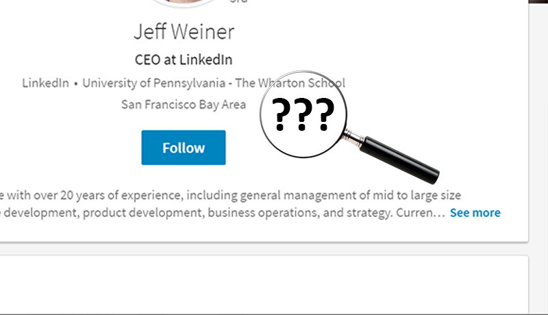
10 Publications and Projects are hidden
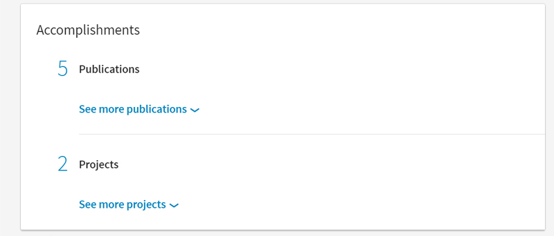
Worse, before your whole list of publications was also visible. Now however none are visible! You have to click to see them! Also it is full-width instead of two columns, causing a great deal of empty white space and taking up screen real estate for nothing. This makes it very difficult to view things at a glance or easily check out a connection's latest project, publication, or article.
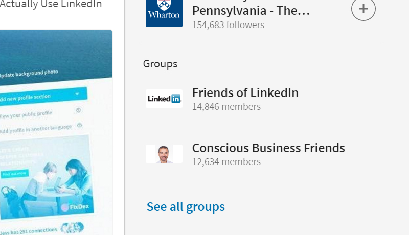
9 Groups are hidden
8 Sticky top menu
7 500+ is too tiny, missing, hidden
It is also completely missing from certain profiles, and hidden to the far right for connections, making it impossible to find at a glance and destroying credibility that you had from having 500+ connections.
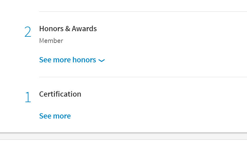
6 Honors and awards are hidden, certifications are hidden
5 It is not responsive
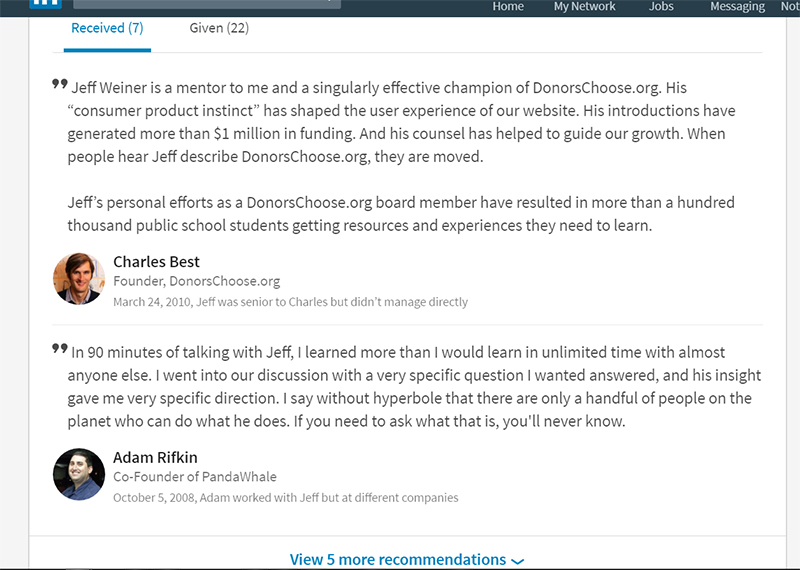
4 Less recommendations visible
3 Giant profile section, tiny picture
Also, the profile picture is not only tiny, but also an ugly circle, hiding half of the picture. Completely unprofessional, and ruins the professionalism of the millions of people who made their profile image based on a square. Look at all that white space!
It would have been much better for the picture to be big, on the left, a square. Like before. That would solve the white space problem. But no, LinkedIn has to ruin it.
2 New "Network" section and connections section sucks
1 They ruined the Skills section
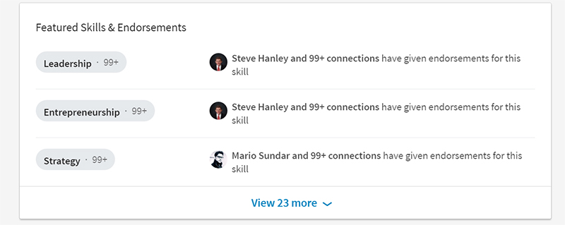
Even worse, they hid all the user pictures! Total crap! I am ticked off about this. Before there were a bunch of user pictures that really lended to the credibility of your profile if you have at least 20 so that all the pictures were filled. You can click the thing and it gives a popup of all the users who endorsed, but that doesn't make up for the fact they hid the user pictures of the first 20 people!
Now the skills section no longer makes your profile look more credible even if you do have 99+ on all of them. Totally worthless, this just ruined the only great thing about LinkedIn.
There are not the only things I hate about the new LinkedIn redesign, they are just the top 10 things I hate about the new LinkedIn redesign. I also hate many other things about the new unwanted LinkedIn redesign.
I predict that LinkedIn will be used far less now. There may be a temporary increase due to the publicity that they have paid for, such as the paid sponsored post on Wall Street Journal which is a fake promotional advertisement and not a genuine opinion, as well as all the other “news” articles that LinkedIn paid for the sponsored content.
Basically, a lot of people might sign up due to the publicity surrounding the awful redesign. But they probably won’t continue using due to the terrible user experience, and current users are likely to drop off very quickly and use other networking tools instead.
So while the publicity may gain some short-term increases in users and signups, in the long run this is going to be severely detrimental for LinkedIn and is probably going to result in the company dying just like what happened to Facebook when they forced the unwanted timeline update on everyone.
It seems that no one will learn. I guess just stop using all web tools because they are all going to be eventually ruined anyway.
What do you think about the new awful LinkedIn redesign? Do you like it? Do you hate it? Leave a comment with your thoughts.


Sometimes is better to stick to a good design and keep it
LinkedIn just banned our official account (officially they call it “restricting” the account, requiring an ID), because we posted a job on there. I guess Microsoft doesn’t want us hiring, but fortunately, banning our LinkedIn account won’t do much to stop us hiring.
Creating a job posting on there was the only time we’ve logged in for years since the unwanted redesign. The redesign ruined it for us, and for many others. The job posting feature is now quite good (a big improvement since 2017), but we got far more results elsewhere in less time.
We will never be providing LinkedIn (Microsoft) with our owners’ ID, so that will be the end of using LinkedIn for us. We will not create another account (because really we have no desire to give any information to Microsoft), and we will remove all social media connections to LinkedIn.
I have over 9600 followers and have been a member for many years. The new site is disfunctional. I need to use a password each time I enter and repeatedly after. If I can’t go back to the old site instead of a useless new mobile site, then LinkedIn has no value to me. Give members a choice and let’s see which they use
You missed the utter destruction of the “Jobs Manager” and associated functionality
I agree. Everything users deem important have now been relegated to the background. I stopped using Linkedin the moment I saw that…
Dear John – feeling unhappy with LinkedIn too, so I feel your pain. Very curious – what exactly are the problems that you have that LinkedIn is unable to solve? Alexander
More than anything the source of this dilemma is the acquisition of Microsoft of LinkedIn. To look for proof only requires you to look at Windows 8 and Windows 10. In Win8 the Metro interface assumed that everyone would use a touch screen or tablet. When this didn’t happen there was huge dissatisfaction on the usability front. With Win10 they still had the MetroUI but with the start menu next to it when you went to the start menu. But they also decided to add a new updating process for the system. As a result you may have to do multiple update processes and the one you may have been used to no longer works. But then again neither does the new one more often than not the update process fails, but there is no notification you are presented with so you may be “un-updated” literally for 3 or 4 months before you realize nothing has been brought current and then you see that the updates are failing. Worse, MS refuses to acknowledge the issues with the process and as a result a number of users have went back to old copies of Win 7 which everyone I know kept a full image of the disk so it could be restored. In my case I just bought a new HDD for the image of Win7 before I started my Win10 upgrade. Make certain that I could boot the HDD and run it on Win 7 for a few days then removed it and put it in the safe. 6 months later when I realized what happened and MS could not resolve it in over a month. I pulled out my new “old” image of Win 7 and put it back in after moving off any of my document files. Went back to Win 7 without any regrets.
Well, let’s face it, LinkedIn sucks. I’ve been active on it for many years and I’ve never got anything out of it. The only thing I like it for is I might be able to track down the name of the HR Manager of a company I want to apply to. Other than that, networking is useless. I have tons of contacts who I don’t know and will never meet. They aren’t going to offer me a job ever. So, why do I bother? Just because I took the time to build an awesome profile. Maybe some day down the road, someone will see it and will contact me with an job offer. Not counting on it though.
I cannot see new recent post now, there is no more option to see recent posts, it looks random and can see a 1 year old post at the top. They say they used an algorithm for better use, but if I don’t want to miss anything then I need to watch all the old posts. Adios LinkedIn.
You’ve completely hit the nail on the head with this review. I have been a LinkedIn user from the very beginning, and have recently given up on it with this latest garbage update. All of the best features are now hidden by dropdowns, everything is more vague and given less importance, and I’ve seen a dramatic drop in activity (new connections + interactions). I guess this was their plan? But why???? Maybe it’s time for a new competitor to enter the arena and do the whole “online resume social network” thing properly…LinkedIn deserves real competition after completely destroying their users’ profiles….
I can no longer find articles on LinkedIn that interest me. You used to be able to click on “trending in productivity”, “trending in healthcare” and see all articles trending in that area, which was a great tool for me. However, you can no longer do this with the new interface. Unless I am missing something I’ve had a very hard time navigating and finding useful information that I once was able to easily find. Extremely disappointing.
I agree. I literally commented on one of my connection’s interesting articles and how he always had such good articles to share. Now I literally never see ANY of his posts!
And likely, all the negative feedback from actual users will do nothing. What a shame.
For freelance creators who have been using LinkedIn to showcase their work online, the redesign has been little short of disastrous, and career-damaging rather than career-helping. E.g.: the fact that the ability to re-order links to external documents, photos, sites, videos, and presentations, etc., has been curtailed, beyond belief. Now the most recent work you link to appears last item on the clunky carousel, and it appears that the order cannot by changed drag-and-drop style, as was the case with the previous LI design. The one absurd feature that could have been fixed — defaulting to ‘Enter’ to send LI messages, which meant that inserting a paragraph break into a draft message caused it to be sent before it was ready — is still there! And now LI takes seconds to load — and for what?
Excellent article, John!
The notifications don’t refresh correctly. Often times it shows I have new notifications with the red dot, but when I click no new notifications are there. I know it’s not working because on the mobile versions of Linkedin and groups the notifications are there.
Also… This: “You must be connected to a collaborator on LinkedIn in order to add them as an author. The author’s name will not be associated with the publication, and the publication will not show up on that author’s profile, until they approve.” is very annoying and forces me to misrepresent myself as first author of papers. Many of my publication co-authors have no linkedin account. WHY can’t I simply list the actual co-authors accurately, as they are cited in a normal list of publications?
100% agree. LI is now more difficult to use than ever, e.g., I am trying to add publications and it is a mess. However, LI won’t be replaced as the de facto site for being found while job searching until there is an alternative, then we’ll have to post the same information on 2 or 3… arrrgh.. sigh…
In my opinion, Microsoft/LinkedIn are attempting to better monetize the site.
Totally agree.
Its actually a case study in the industry, all of them included!
The previews layout was far from optimum, but a good example for others to follow, and keep improving. Towards more clean, mature, coherent, social and professional networks.
Will it be realised sooner or later?
That’s where we all, power users, should be focusing on.
😉
I hate the new LinkedIn format. As a business who showcases my work in my profile, I just found out that prospective clients are not seeing examples of my work and not seeing the total picture of what I do. The past two months, I could have lost potentially hundreds of clients! We all need to join forces to get LinkedIn to change this. Their website is not conducive to business, jobs seeker or recruiters any more. Let’s band together!!!!
Microsoft paid billions to ruin linkedin and run its customers away.
LinkedIn Lobotomized itself – this is unacceptable – search for firms based on their size? Even the free text search on person’s title does not work.
Eran, its unbelievable. Even the aesthetics have been mucked up. Its just not a pleasant place to spend time researching any longer. I despise the new round photos, and especially the fact you can’t hover over a photo/name and see the persons company affiliation.
They removed most search filters unless you pay more, even if you paid for a year in advance. And the new search is absolutely awful. The filters they did keep are not a drop down menu but fill in when you type so you have to guess what the field might be.
You also have to pay to search your own contacts.
It has been an absolute disaster.
Listen, I am emailing back and forth with the LI team daily. Lodging complaint after complaint. Yesterday I received a spam message trying to sell me some garbage, in my messages inbox, disguised as an inmail.
I reported to LI this, and the canned response was ridiculous. “Can you send us a screenshot?” Well no I said, I of course deleted the message. I told the LI woman who emailed me that I only WISH a spam inmail message was the worst thing about the new LI.
I just noticed something new today that is ridiculous. Used to be, after you spent an hour carefully crafting an inmail, you could then, as the author, copy and paste it into another email later.
Not anymore. Now it has a grey box behind the text when you paste into an email.
Great. Thanks again linkedin turdbots.
Fortunately, this particular problem has an easy fix. First paste the text into notepad++ (or notepad) which will strip out all the html. Second, copy the text from notepad++ and paste that into your email. No more grey background. Hope this helps!
Oh wow. Thanks a lot for the information John. I will do that. Cheers!
The new UI is really horrible. My pet hate (the pretty well total destruction of the notifications feature, so that it is now poisonously difficult to discover which of the discussions one is interested in have new comments) isn’t in your list of 10, but I agree that all your 10 are hateful.
The connections section is horrible now. Can’t see the tags, cannot organize by anything except “newly added” or “last/first name”, cannot see whatever correspondence you had with any of your contacts. I imagine they totally truncated the free services in order to get more people to pay for the subscription, which –I assume, with all the known implications of assuming anything– features all the bells and whistles that were once in the free version.
And that, my friends, is what happens when oligopolies form.
Good article. I have two more gripes.
1 – Can no longer tag contacts. Previously, I could tag my contacts and sort them. This was great for sectioning out contact by role; recruiter, agency contact, publisher contact, media buyer, c-suite, etc. Not only can I no longer add tags but it seems as though my tags are now all gone. Now I can only sort my contact by first or last name or by chronological order. All of these are beyond useless.
2 – Job searching now sucks. LI is pretty much useless at this point. I have an alert set up for “Customer Success Manager” yet I’m being fed posting for “Technical Support Engineer” and freaking “Chief Revenue Officer”?!?! What the living hell LinkedIn?
My remarks:
– The GUI design is done very clumsy and not really an improvement
– The majority of the jobs come from search engines with old data and are not entered by HR. The quality is here going down also.
Microsoft what are you doing? Keep on going and you can close your Linkedin business soon.
Are they not even paying attention to these unanimous reviews (well over 80% saying the same thing) of how utterly atrocious LI UI has become? Or do they, just like Apple, simply not give a hoot?
Well said article here, and only the tip of the iceberg on just how bad LinkedIn is now! I can’t even figure out how to write a new article now, where before it was a cinch! LinkedIn has committed suicide! Why oh why do they feel it necessary to follow in the steps of Apple and completely sabotage their own company?
Is corporate suicide the “in” thing now? Has it become cool to jump off a proverbial corporate bridge? I am at an absolute loss when trying to find a shred of logic or sanity behind any of this! I am cancelling my LI account forever after 9 years, just as I have banned all Apple products after 15 years of being a loyal customer, though I am sad about having to forsake OS-X, which is very nice. Is there another alternative for LinkedIn that anyone can sincerely recommend?
I agree, although I’m not sure Microsoft cares enough to get any consumer feedback or respond to it. And since they are worth so many billions, they probably won’t even really notice when millions of members stop using it or cancel their subscription.
Good questions, it does seem to be the trending thing occurring and it is beyond me how so many companies can completely destroy websites. LinkedIn sold out both metaphorically and literally and give away their company to Microsoft for a nice payday – I suppose it is to be expected that when LinkIn sold out and gave away their company to a notorious company killer that it sould be expected that Microsoft would destroy it (read about microsoft’s malicious history or killing competition).
Also good question, perhaps I will make another post about some LinkedIn alternatives.
I noticed how “commenting on this story has been closed” was on one of LI story on LI. Obviously the massive number of negative comments didn’t jive with the folks at LI and or Microsoft.
As a Business Analyst – I am quite disappointed with the unannounced – unwanted – changes to the UI.
I shake my head in disbelief that they could take such a useful tool and basically destroy it in one failed swoop of downgrades. I am especially annoyed that they took away the Advanced Search Function (when in fact that is why I changed to the paid version two months ago at $32 dollars a month in the first place.)
Unfortunately I will be cancelling my LinkedIn subscription as well.
Thank you John for your astute article.
On the new LinkedIn site I feel like I have to compete for attention even on my own profile. The profile that was previously my personal space for shameless self-promoting has now been reduced to a nonsensical rubble of logistical recounts of my accomplishments.
Before the change you’d already won half the battle if an employer made it as far as your profile because you’d arranged your items and skills in the way you’d want them to notice you. But now… Now you have to have to look exceptional in 3 words or less or the employer won’t even stay on your profile for long enough to even notice your skillset.
If the top three skills aren’t what they’re immediately interested in they’ll leave without as much as a glance at your other highlights, even though what they are looking for is right there. Right there, 5 clicks of “View more” away from their sight, 5 clicks away that will never happen. It’s as if the people designing LinkedIn have never applied for a job or been on the hunt in their entire lives because the site isn’t designed with the user interest in mind.
I agree that the redesign is a UX disaster.
For me, one particular disaster is that one can no longer re-order publications. Before, I had carefully moved each new pub to the top of the list, creating a standard reverse-chron listing, but it seems that now you can’t move anything around. AND it dumps the new item at the bottom of the list (listing things in chronological order, as opposed to reverse, on a website – who does that??). So no my publications read 2017, 2016, 2016…1998, 2017 and no one will ever, ever see my latest and most relevant publications.
I am hoping that I am wrong and have overlooked this functionality… point it out to me if it still exists.
Doesn’t allow tagging anymore. And can’t pull them tags. I had all my contacts organized by tags – what conference I met them, a recruiter, former colleagues, classmates, now, all gone.
LinkedIn is now useless. I can see nothing but a bunch of advertisements and Facebook type social posts. Apparently it wasn’t obvious to them that few people are likely to go to a website to look at other companies marketing posts and nothing else. Can’t wait for the inevitable replacement to LinkedIn to appear.
LinkedIn use to be a decent distraction from work and something I would use for networking. Now, I can barely read the profiles and I’m 43 and don’t wear glasses.
They must have hired the New Coke marketing company. Will visit the site slightly less than MySpace.
I abhor the “redesign”. And trust me, it’s just as bad for premium accounts too.
That you can no longer hover over a name or photo to see the company association is just absurd.
Among 100 other things that render the site no more than a jumbled up mess.
John, you nailed it and then some!! I have been on LinkedIn for 10 years, even before Facebook, as this was my go to Social Media site! I have been a paid member for 5 years now and have taught thousands of professionals on the use of LinkedIn for business. And I am at a total loss at this redesign.
I have cancelled my subscription with them and may actually close my account as it is broken now. It is slower, not responsive at all and a few times I got a “Its not you its us” Error message and couldn’t get to the site. I am cancelling my training classes on it now as I just cannot see the positive use of this site anymore.
I like change, I challenge myself every day but not change that isn’t wanted, isn’t useful, and actually breaks something that was working. Again, I hate complaining, but this one really has me mad as I paid for this monthly which wasn’t cheap to not even be asked or brought into some user group meetings for this. Thanks for posting this as I shared it already on LinkedIn as well and have had many folks private message me about what to do now? How can we get them to change it back? Is all hope lost? HAHA! Thanks for this article!!!
I hate that you can’t override text in the headlines/subheadlines & change the photo when sharing news articles. These often autopopulate as unsightly and/or are code/irrelavent text. The old format allowed you to fully customize any post you shared. Booooo!
Agree with all complaints; particularly about the small circular icon image (like FB), difficulty finding “Projects”, etc.., lack of endorsement images, inability to add/suggest “skills” to ‘Connections’ and, of course, Li tech & management is soo unresponsive (outsourced & out of touch) – purposively).
T. Michael Stephens Constructive Artist / Coordinator Art Research Center/A.R.C.Group / Editor, Publisher New Circle Publications / Principal Designers Collaborative Consortium
The new LinkedIn site is horrible, almost everything is now hidden and I can’t reorganize the order of my new certificates as they are automatically shoved to the bottom of the list. There is also no way to add new media and you cant even edit the old ones. I am now motivated to have my resume on my own website as I had been ignoring that for years thinking there was no real need since LinkedIn was available. Thank you Microsoft for ruining what was once great!
Changes were made for one reason. They want you to purchase a premium plan to get the features you want, or suffer through LinkedIn Lite.
That doesn’t account for the terrible design or any one of the listed items in this article that are ruined.
I agree with all of the comments above. LinkedIn is now trying to become the Facebook of the work environment. Goodness help us all. I read above that someone had found a German site which is an equivalent of LinkedIn. They should post it for everyone so we can all migrate. Microsoft sure blew this one up. I logged in to get messages and then spent a ton of time trying to find out how to get to my profile where before it was a button right on the top bar. Who cares I guess if people were happy, just make it worse.
I’m a user, and it’s a matter of time, this article presents me the reality that needs to be interpreted within LinkedIn, with this perspective, LinkedIn, and especially with these users, and the reality of this article is very fair, simply because the first reference is based on this profile picture, and this is true, because I think that nobody will accept this, I think there is no chance to escape it.
Well, a lot of good points on issues with LinkedIn, but not the main issue I see.
In my opinion the main issue is the removal of free ‘tags’ personal ‘notes’!
I run a volunteer based job club for mid/senior managers and business/technical professionals. The club trains people on how to conduct and succeed in their job search, and LinkedIn was THE tool used by recruiters and employers to check prospective hires, THE tool to find where former colleagues had secured employment, check out their employer’s performance and the sort of people they recruited. It was THE tool to research a company and marketplace to identify potential employers for a speculative approach or introduction. THE site to identify the education and CPD valued by employers. All of this could be searched within your geographic commute or relocation area and with a little research the company staff retention rate.
Groups were the key feature that really helped you stay on the pulse of what was happening in your professional area and participate in high valued discussion often hosted by that profession’s thought leaders. Now it is relegated to a shadow of it’s former self. The same with Pulse the LinkedIn tool that gave you the key facts in 5 minutes a day to keep abreast of your professional news, developments, thoughts… What is it now an irritating mobile app.
LinkedIn was THE ESSENTIAL TOOL FOR EXECUTIVE AND PROFESSIONAL JOB SEEKERS.
NOT ANYMORE.
LinkedIn is now nothing more that a cash cow to maximize its users personal data with next to no benefits left for those members.
When I signed up I made a value proposition, was it worth sharing so much with an online database? Until this new software interface of decimated functionality arrived it was. NOT ANYMORE.
I am very very angry and have been used and abused by Microsoft and to add to the insult I was never asked, given an option or told what was happening. What makes it even worse was that I am a Premium Account user paying for the features of LinkedIn that are no longer available to me. Did Microsoft contact me by email to say these are the features you pay for and these are the ones being removed? NO!
Where next for those of us who have used LinkedIn to such great effect over the years? It certainly is not LinkedIn.
Somehow or other we need to create an alternative or get Microsoft to go back to the old functionality, can you see that happening? Microsoft never ever admit to a mistake or doing anything to the detriment of their customers. For me the new generation of “Alternative Facts” that Microsoft is peddling as improvements is an insult and rip off of the customers who have used LinkedIn for so long.
In my mind the worst thing about the “new” LinkedIn interface is the fact it is unbelievably slow. I’m talking as in trying to pour maple syrup out of a jug while standing outside during a Vermont winter! Compared with the user interface for any other website on the top 100 web destinations, LinkedIn makes the user feel like they were back in the dial-up days of the Internet.
There is simply no excuse for such a sluggish interface except just plain poor design!
Every time LinkedIn changes its website, they make it worse. I was already unhappy with their website. These latest changes, though, make it nearly unusable for me. I am very unhappy about how they’ve delinked projects from the experience section in the Profile, making it even harder to organize my coursework and certifications, making the profile views section almost impossible to find, etc., etc., etc. This may be the year I cancel my LinkedIn subscription.
I hate LinkedIn now. I wish someone can establish a website like this but avoid these mistakes. They are greedy and don’t care about the users.
I am livid and feel helpless with this new horrible design. I always say, If it isn’t broken, do not fix it. Come on. This is enough to make me want to retire. Please, please go back to the old site. It worked.
I write quite a few posts. Now on my profile people have to scroll down a list that that only shows one or two at a time.
John what you saw was only the profile problems. For me is even harder. As a headhunter I use to use linkedin 90% of the time when I was searching for a candidate. Now I can’t search it right anymore, not even with the 900$ dollars account – USELESS!!!
Some of the problems (as a headhunter) that I found:
1) Chat option! You no longer send a message and wait for a respond now you’re having a chat(I’m abused by ppl without work to get them a job – but maybe they are not in my area of expertise – so I can’t help them) – my assistant(girl) is harassed by her connection: to go out for a coffee and sex!!!
2) Their boolean search is made for headhunters, but their “NOT” function doesn’t work properly so it’s a waste of time.
3) Sometimes the recruiters are searching keywords from your job description like: “I was working in middle east/asia/etc for X company and then …..” – and try to pick from there what they actually need. Now all your job description is useless as the search engine doesn’t care about your description only about position
4) Less results, because of the point 3 if you search engineer on old and new design you will find differences of 10.000k results of even more (depends on city)
5) You no longer search with postal codes / range / area
6) We all know those “Say congrats” – advice – watch out how many times you will send it to the same person over and over again!!! I’ve sent to a guy 3 times “congrats on your new role”, 3 days in a row
7) Even seeing a common connection to a 2nd connection search I have to search it from his profile
8) How do you search all of this? Surname+Name+university+location+keywords
9) I found a german website that has the same role as linkedin – cheaper (it’s cheaper than my phone cost/month), I will stick with it and learn it until linkedin rolls back the design or lose 10 accounts of 100 euro’s each!!!
Dear John Watson, thank you for your important great post; I shared your post on LinkedIn:
https://www.linkedin.com/hp/update/6238110949434322944
The worst part about the upgrade has been the lack of functionality when searching and making lists. I think that is now only an option for the most premium user. It is not user-friendly at all, surely they will see the lack of people using it and think something must be up……or they see the figures from the premium package and not care.
I agree with all of the above comments. The new design sucks bad and I won’t visit LinkedIn nearly as often!
the biggest issue is they took away TAGS which is the only way you can organize your connections – it’s absolutely horrible. They took away months of hard work by eliminating TAGS and blending everyone together. Who been contacted? “I don’t know, the tags have been taken away..” Who’s been moved into a calendar? “I don’t know, the tag has been removed.” I hate Linkedin it SUCKS!!!
Absolutely miserable for anyone with vision issues. The fonts and font sizes, the amount of white space, having to search and click for almost every detail. Just awful. Want the old UI back. 🙁
Used to really like linkedin, but that’s out the window now. Hopefully someone will take notice of all the user complaints and bring back the old website….
It is really difficult trying to search for anyone – it was hard enough with the old format! Now it’s all gone to a standard shift mentality. From dumb to dumber! This is the guidance they give you:
Constructing more complex queries from the search box
Search operators can be used directly in the search box to narrow your results. Search operators complement the filters on the right-hand side of the results page and the AND, OR and NOT boolean operators.
LinkedIn currently supports the following search operators:
firstname: Finds members based on first name
lastname: Finds members based on last name
title: Finds members based on their current title
company: Finds members based on their current company (keyword search)
school: Finds members based on schools attended (keyword search)
Here’s a quick example: to search for current software engineers not named Doe, who have attended either Harvard University or Stanford University, try:
title:”software engineer” NOT lastname:doe school:(harvard OR stanford)
When using search operators, remember to use quotes for multi-word search terms, and parentheses for AND, OR and NOT phrases. Still need help? Check out Searching on LinkedIn.
NOBODY HAS TIME FOR THIS!
I agree, they should have left everything alone.
I concur with all your findings. But what hacks me off is why try and fix something that isn’t really broken. Yes it needed a face lift to freshen it up, but not the “Full Works”… Like you said there is far too much “White Space” which you eyes naturally gravitate towards and distracts you from the main content. It’s far too fragmented and very sloppily put together for a professional portal. Someone in their design studio need firing!! And lastly why were we not given the “Option” to remain on the old forum layout. One day happily using it, then bang, next day new design layout. Arrghhh!!!
Dislike the new design so much that I don’t want to use LinkedIn, and I’m job hunting. :-\
So John, has anyone from LinkedIn read your excellent and helpful suggestions?
Why and how is LinkedIn so awful? I cant seem to find a page, an explanation, or a person who has an actual working brain?! No one gets back to you or if they do actually respond, it never answers the question or tell you how to do what you want to do. Do they all have some sort of limited intelligence? I’m baffled. and wondering whether to stay there or not. Sigh!
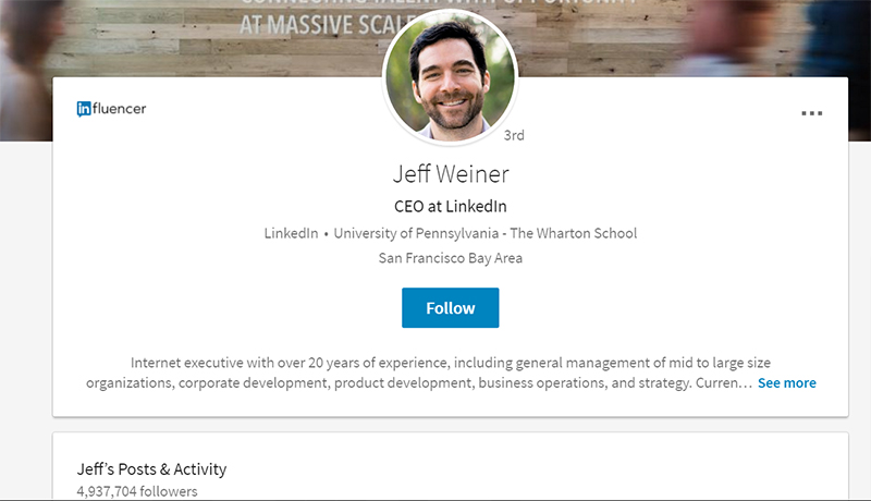
Hi Constance, no, no one at LinkedIn has contacted us thus far. However, I doubt they really care. If they cared, they probably would not have forced this awful redesign. People need to contact Jeff Weiner, I’m not even sure if he has any clue his company is on the brink of losing the majority of its userbase.
I agree. The new design sucks. I used to have a premium account but I just cancelled it, as LinkedIn is no longer useable. I don’t pay for crappy interfaces. I suggest an email campaign to LinkedIn support in protest of the new design. If you can ever find the support page that is.
Agree. I guess they need to keep their programmers busy doing something to justify their salaries. I cannot believe they ruined this. Can’t figure anything out and don’t have time to dedicate to this. Some of us are busy at work.
I was just in a meeting yesterday with our Sale Nav. rep, she stated that I was the only push back that she had received since the rollout. Ha, I’m sure it was just me. I cannot imagine anyone else would like less features, and less usability.
The new design is just awful in every respect. Can’t think of a single thing I like about the redesign. And they took away the only fun thing, which was the profile view rankings. At least I’ll get more work done now because I won’t be going in and out of LinkedIn very much.
Yep – totally agree with all this. LinkedIn now officially sucks.
OTOH, I won’t be spending near as much time there as I used to.
If Microsoft wanted to make products that didn’t suck, they’d make vacuums.
Couldn’t agree more – The new design is a step backwards …I can only hope this is a two/three stage development that will at its end be much better. I spend ages, literally ages designing my company page to be as optimised as possible for our customers/connections to EASILY find information – only for LinkedIn to rip it all apart and leave me with un-intuitive layout with lots of white space. My eye has no idea where to start from …and no natural way of being directed around.
I think now i’ll invest more time into Google + and Tumblr …which admittedly are less useful overall – But in many ways are better tools for advertising and communicating.
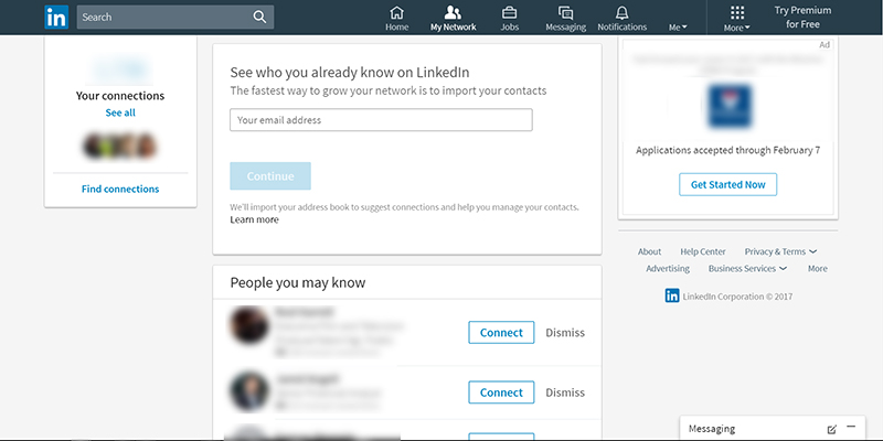
You can’t hover over the tiny pictures in People You May Know to see who your connections are. You have to click the person, sending a “view alert” to the person when that’s not at all what you want.
Awful
I don’t like it either. At least they should propose their users if they want to upgrade for a new design or keep using their current design. I don’t like it.
I totally agree with all of the comments. The previous design was effective and graphically pleasing. I find myself using LinkedIn 75% less than I did before. Looks like they used the approach “if it isn’t broken, then let’s break it and fix it”.
You forgot to mention that we are no longer able to search content on the members posts – That also means that your post or articles will reach far less people as they will not be able to find you using key words
There are more and more problems and limitations I am finding. Including you are unable to view all projects, even when you click “read more” you can do that 20 times and not expand all of them. Meaning near 100% of people will never ever see your oldest projects, and 99% will only see the couple most recent, if any. They have removed the gauge which tells you “advanced”, “all-star” etc for having added the most things to your profile. Lots of things are missing. The new notifications doesn’t work properly. If you unfollow someone, nothing happens – but if you refresh the page you can see it did. This redesign is absolutely horrible and has ruined the site. I won’t be using LinkedIn anymore.
The LinkedIn site was terrible before. Constant errors, constant need to merge your name into every inch of screen real estate, terrible grammar and language. This is unlikely to change much.